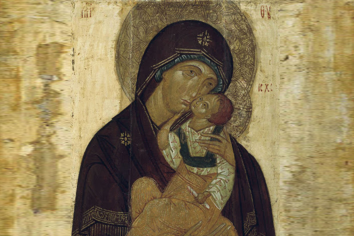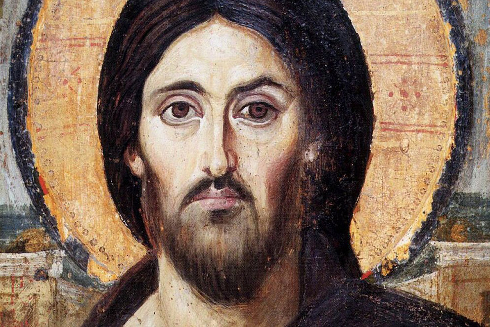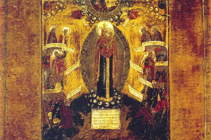
Iconography follows duplication of the icon – creating an image based on an existing one. We know that in ancient times, duplications were often made from miraculous icons, and they were also subsequently glorified as miraculous. But why then do Kazan, Vladimir, and Don icons of the Mother of God look different and why do we recognize them by the details of iconography?
The word “duplication” must be correctly understood. This understanding was somewhat lost during the time when church art in Russia did not develop. “Duplication” does not mean that the church artist duplicates as like as two peas, just copies the image. If it were so, we would not have all that rich heritage, a marvelous gallery of images of Orthodox icon painting. And in different churches the same faces would look at us, as if Christian art was inanimate.
Most often, the icon painter created a duplication in the style of the era and in accordance with his artistic tasks, bringing something new to the interpretation of the image. In this case, the artist, of course, remained within the framework of a strict canon. Icon rewritings took place as well – when they wrote a new one on top of a darkened image.
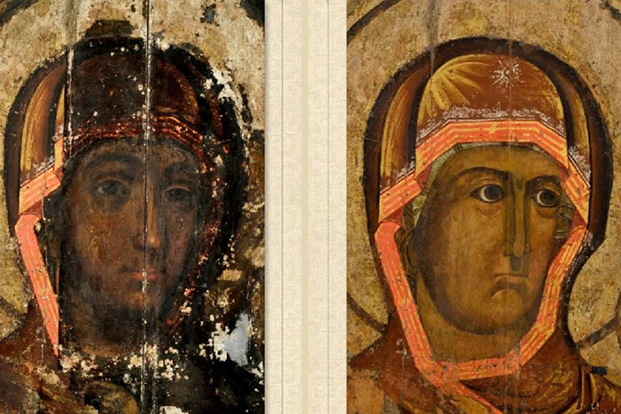
Therefore, icons with the same name and, accordingly, iconography look different. Do not be confused by this. For example, several years ago the Smolensk Icon of the Mother of God was restored – the gateway image that Boris Godunov presented to the city of Smolensk. The holy face of Hodegetria, which opened to people, surprised many with its expression and inconsistency with the usual image. However, according to the conclusion of the restorers, the icon was painted at the beginning of the XVII century, and the painting is consistent with that time.
Translated by The Catalogue of Good Deeds
Source: https://foma.ru/pochemu-ikony-s-odinakovym-nazvaniem-ne-pohozhi-drug-na-druga.html


